
Solrise Essentials
A Brand Identity That Radiates Resilience
Brand
Sol Rise Essentials channels the sun’s energy to support mental wellness through affirmations. To reach a broader audience, it needed a refreshed identity that better reflected its mission.
Project
Brand Strategy
Logo + Identity Systems
Iconography + Collateral Designs
Brand Style Guides
Industry
Wellness & Personal Development
THE CHALLENGE
Sol Rise Essentials needed a cohesive brand identity that would resonate with a diverse audience while staying true to its core values of resilience, unity, and personal growth. The challenge was to create a visual language that felt uplifting, engaging, and inclusive, ensuring that the brand’s message remained accessible across all age groups.
THE CHALLENGE
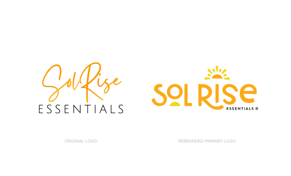
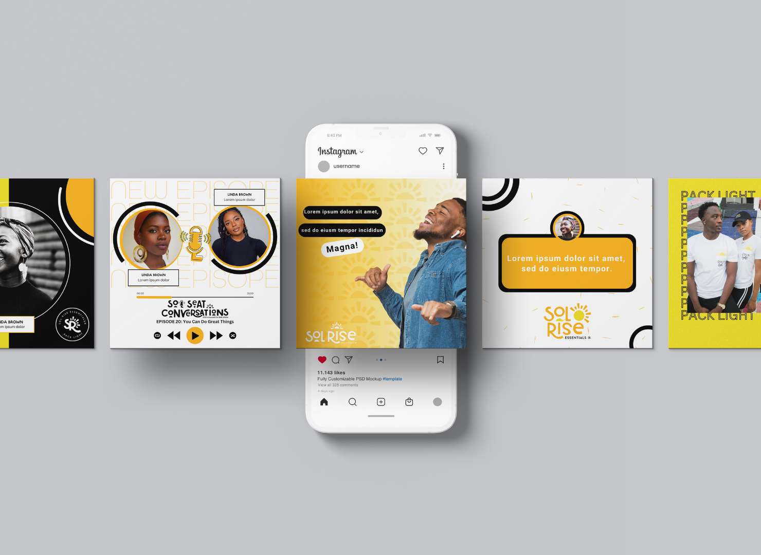
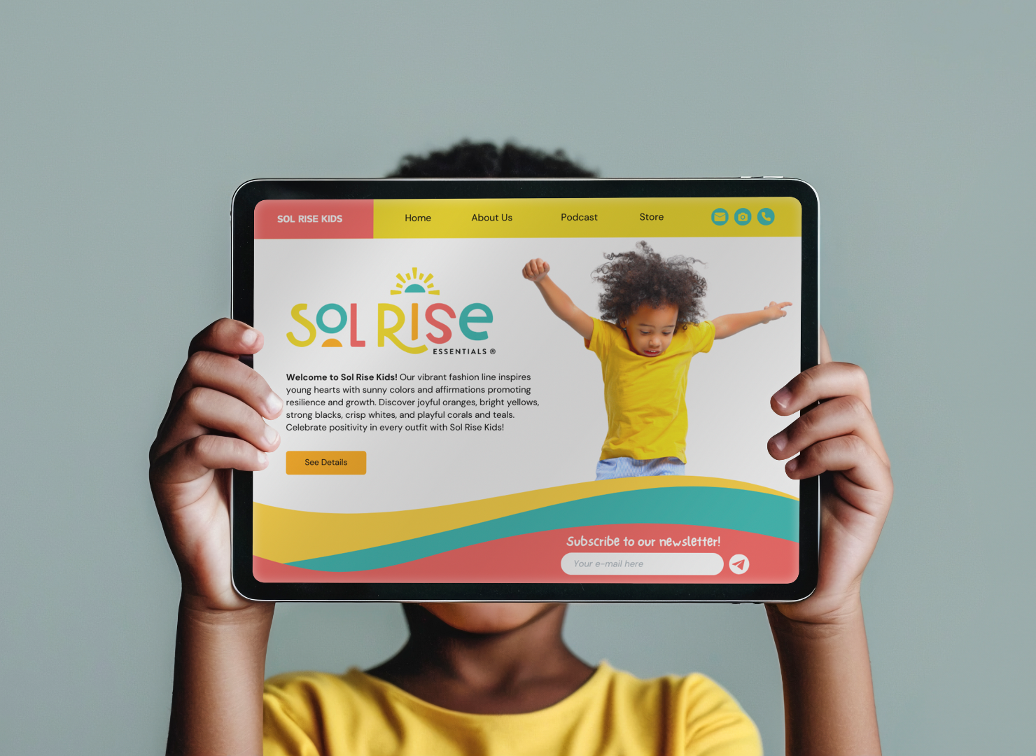
Through brand strategy, we refined Sol Rise Essentials’ identity to visually and emotionally reflect its mission. A custom font balances strength and approachability, while a vibrant palette embodies optimism. Iconography—including a sun, microphone, and globe—symbolizes hope, storytelling, and unity, creating a cohesive brand experience.
THE RESULTS & IMPACT
The final
Sol Rise Essentials identity is a bold and uplifting brand experience that extends beyond a logo—it’s a
symbol of resilience and empowerment. Key elements include:
✔
Refined brand identity to strengthen the mission and broaden audience appeal.
✔
Developed meaningful iconography (sun, microphone, globe) to reinforce brand messaging.
✔
Created a vibrant color palette that embodies warmth, resilience, and unity.
✔
Established a cohesive design system for brand consistency across digital and physical touchpoints.
This rebranding solidifies Sol Rise Essentials as a beacon of encouragement for all ages, ensuring that its message of growth and transformation continues to inspire its community.